

 T-shirts
 Polo T-shirts
 Embroidery
 Sweatshirts & Hoodies
 Women's clothing
 Kid's clothing
 Hats
Hats
 Featured Brand
 Bar & Restaurant
 Construction
 Conventions / Expos
 Medical
 Nails / beauty salon ..
 Events & Celebrations
 4th of July
 Black History Month
 Christmas
 Fathers Day
 Halloween
 Animal Causes
 Autism
 Cancer
 Non-Profits
 Walks / Runs / Marathons
 Sports & Teams
 Baseball
 Basketball
 Badminton
 Bowling
 Hockey
 College
 Clubs / Organizations
 College Sports
 Departments
 Greek Life
 Homecoming
 Real Life Heroes
 Air Force
 Army
Army
 Coast Guard
 Medical Staff
 Fire Department
 K-12 Schools
 Chorus and Choir
 Class Of
 Dances & Prom
 Drama
Drama
 Clubs
Clubs
 Bible School
 Church Youth Groups
 Mission Trips
 Meditation


When it comes to children’s palettes, we often think of bright, colorful colors. However, it is because of this common belief that many baby-oriented brands or mother-baby items become too similar. This makes it very difficult for your audience to distinguish your brand.
So how should we combine colors? Brands are not necessarily only allowed to use basic colors (red, yellow, blue) but can also combine with many other bright colors without lacking subtlety and courtesy.
Basic palette
As shared above, basic color palettes are indispensable for brands aimed at children. However, with this basic palette, the colors have been tweaked to be fresh, as well as toned to increase sophistication while still keeping children’s colors. Combined with white, lead gray, and pink, the palette is softer, more dynamic, and more flexible.


The silent base color palette
Silent colors are primary or secondary colors that are further combined with different gray levels to create a softer, deeper palette. There are also shades of red, orange, and blue – but when mixed with a little gray, these colors become more subtle and more applicable. These are the colors that are very popular in the Montessori school system – a kind of kindergarten that emphasizes natural curiosity and learning through activities.


The pale secondary color palette
Secondary colors are created when primary colors are mixed together. This secondary palette is also mixed with a bit of white and gray, creating a Nordic children’s palette. This is also a color palette that is quite suitable for other product lines such as stationery because of its lightness and brightness.


Basic carpentry palette
It is called a rustic palette because in using this palette you should combine muted primary colors (red, yellow, blue) with rustic materials and colors like beige from wood and wool, or blue. Sage comes from natural leaves.

Basic color palette combined with turquoise
A palette that is quite fresh but still does not lose sophistication, when the primary colors red and yellow are combined with “offline blue” to turquoise. Because of the bright nature of this palette, it’s a color palette that’s well-suited to photo shoots have taken outdoors or where there’s a lot of light. To make the palette more interesting, try combining these colors with different pale yellow tones instead of white.


 Short Sleeve T-shirts
 Long Sleeve T-shirts
 Tank Top & Sleeveless
 Tie-Dye T-shirts
 Soft Tri-Blend T-shirts
 V-Neck T-shirts
 Pocket T-shirts
 Made in USA
 Sweatshirts Hoodies
 Hoddies
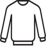 Crew Neck Sweatshirts
 Full Zip Sweatshirts
 Quarter Zip Up Pullover
 Heavyweight Sweatshirts
 Fleece Jackets & Pullovers
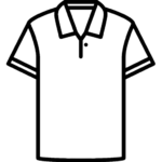 Polo T-shirts
 Performance Polo Shirts
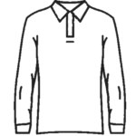 Long Sleeve Polo Shirts
 Golf Polo Shirts
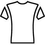 Short Sleeve Performance Shirts
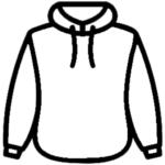 Performance Sweatshirts & Hoddies
 Performance Tanks
 Quarter Zip Performance Shirts
 Rash Guards Swim Shirts
 Performance Sweatpants & Joggers
 Track Jackets
 Shorts
 Nike
Nike Adidas
 Outerwear
 Rain Javkets
 Insulated & Down Jackets
 The North Face Jackets
 Work Jackets
 Vests
Vests Gyms & Fitness
 Landscaping
 Pets store
 Band & Orchestra
 Club
Club School Pride
 Hanukkah
 Mardi Gras
 Mothers Day
 New Years
 Patriotic
 St. Patrick’s Day
 Thanksgiving
 Valentines Day
 Cheerleading
 eSports
 Football
 Golf
Golf Lacrosse
 MMA & Boxing
 Mud Runs
 Hockey
 Pickleball
 Poker
Poker Soccer
 Swimming
 Tennis
 Track & Field
 Volleyball
 Wrestling